LiteIDE UI readbility
Author: DracoznyCreated Jun 4, 2018Updated May 24, 2026
Please answer these questions before submitting your issue. Thanks! Please download LiteIDE latest version and test before submitting your issue. Thanks!
What version of LiteIDE are you using (LiteIDE About - Version and Build Qt Version)?
x33.3 QT5.5.1 (64bit)
What version of Go are you using (go version)?
1.10
What operating system and processor architecture are you using(go env)?
Linux (mint 18.3) AMD64
What did you do?
Installed and started LiteIDE
What did you expect to see?
An interface that is easy on my eyes or at the very least configurable to be so.
What did you see instead?
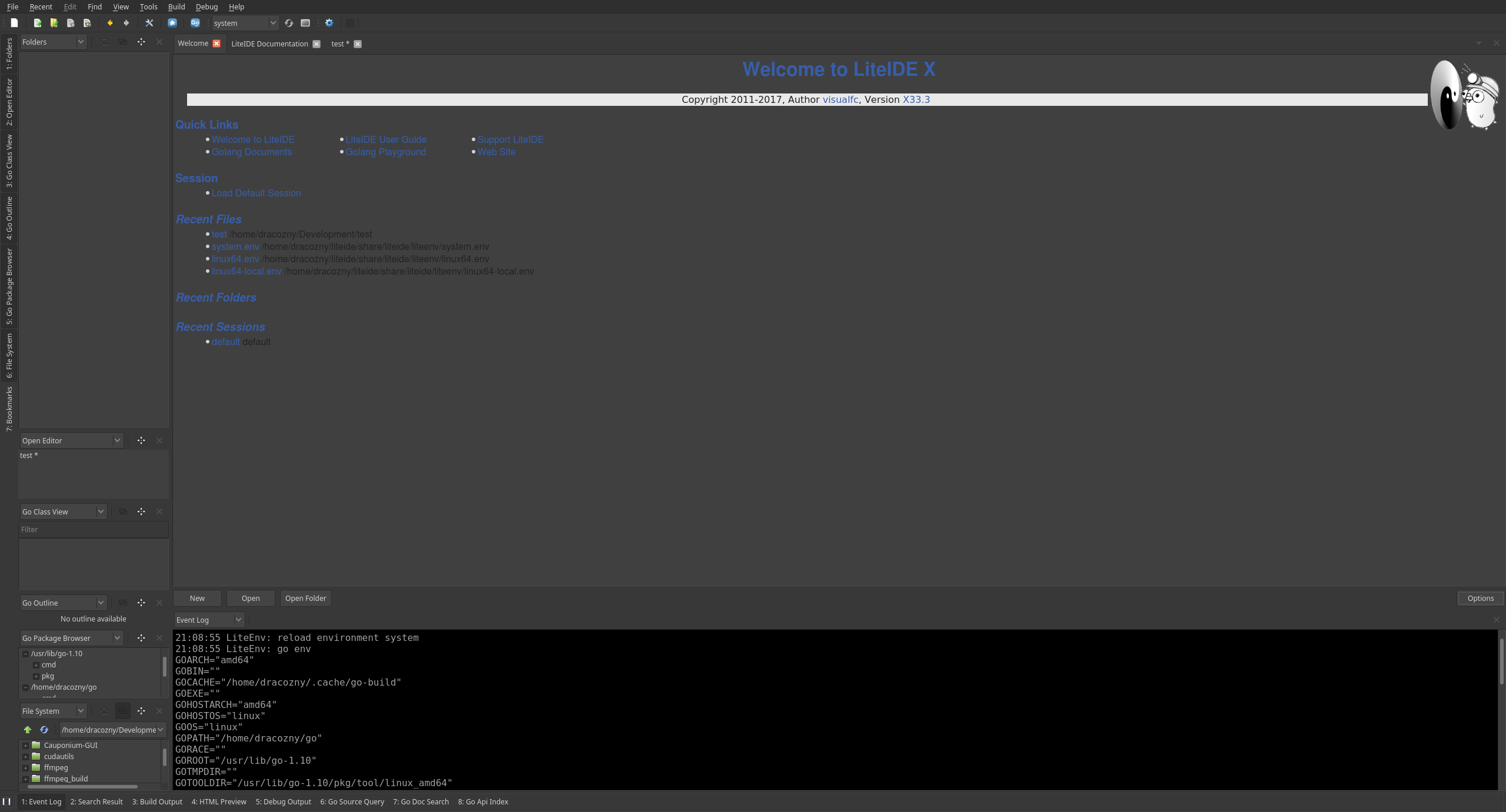
Bright blue and fine black lettering on a gray background that is painful to read. Especially on the Welcome and Doc windows.
I can control the main editing and output sections which is fine, though it would be nice to have more control of the output window since the background is not controllable unless it is set to be the same as the editor. The rest of the interface needs to be theme-able.
Source: visualfc/liteide