UI - Destructive Button UI changes to apply the rule about destructive buttons.
Requested by: @micsblank via YakShaver.ai cc: @kulesy, @micsblank, @adamcogan, @JackDevAU
Hi Team!
Url from screen share: https://tina.io/admin/index.html#/collections/page/~
Pain
Most of this shipped in https://github.com/tinacms/tinacms/pull/6063 (October 2025). Delete is now last in the collection list overflow menu and the rename icon is grey. Two things are still wrong, and nobody has checked this issue against the running UI.
Hovering Delete turns the label blue, the same hover colour as every other item, so the destructive action looks like Rename and Duplicate at the exact moment the pointer is on it. The bin icon keeps its own red, so you get a red icon beside a blue label. The hover rule wins on both order and specificity, so reordering the classes will not fix it.
Delete also sits flush against Rename with no divider, so it is at the bottom but not away from anything. The design system already ships a separator and a destructive item variant; this menu hardcodes its own red instead.
Acceptance Criteria
- The delete label stays red on hover.
- The bin icon and the delete label match in every state.
- Delete is visually separated from the item above it.
- The menu uses the existing destructive variant and separator rather than a hardcoded colour.
Screenshot
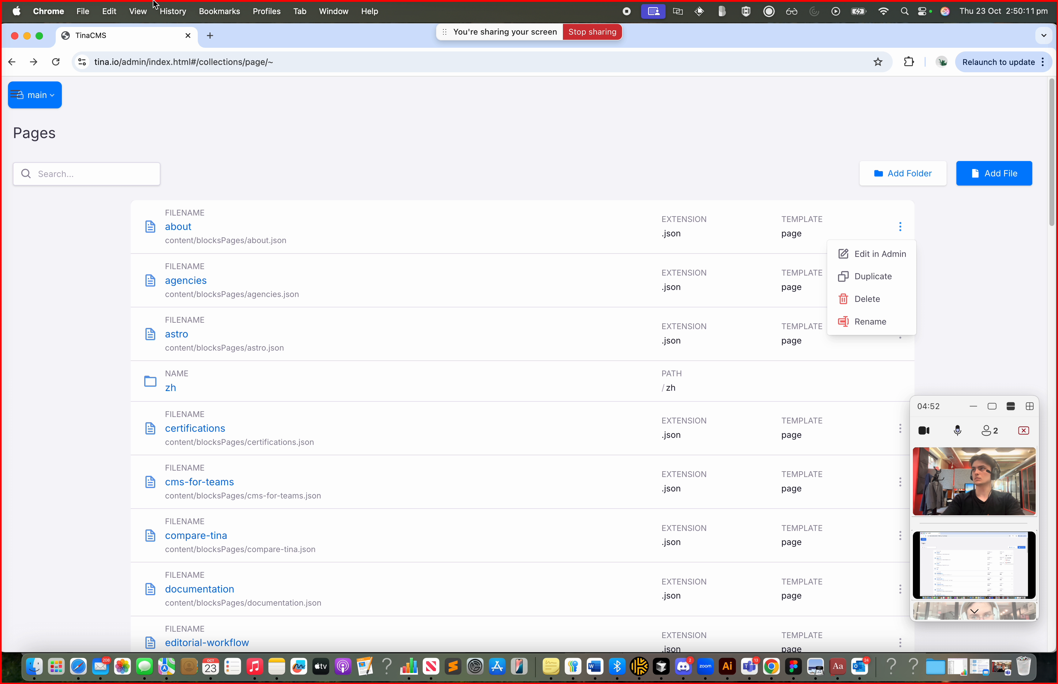 Figure: Delete button text should be red and placed at the bottom; rename icon should be black or grey.
Source: tinacms/tinacms