Feature Idea: Swap order of comment and description sections
Summary:
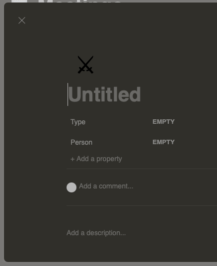
Currently the comment section renders above the description section. I personally find this a little inconvenient when working on a board alone because I rarely ever use the comment functionality but I very frequently edit or read the description section.
Even in multi-user scenarios, I think it would be more intuitive to have the two sections swapped. When looking at a card, it seems more likely that you first want to understand all the details about the card before reading other people's comments. As an example, Jira (not that it would be the pinnacle of UX) displays a task's summary, description and attachments before the comment section.
Instead of (or in addition to) swapping the sections, there could maybe also be an option to disable comments or to freely reorder the two sections per card (though that might be overkill).
How important this is to me and why:
Importance: Low
Use cases:
- I want to parse the information on a card without other people's comments getting in the way
- I'm a single user and don't want to use the comments
Source: mattermost-community/focalboard