frontend: PluginSettingsDetails: Disabled Save button looks enabled due to hardcoded inline styles
Describe the bug
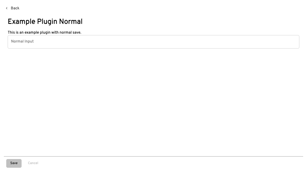
In Settings → Plugins → (plugin details), the Save and Cancel buttons use hardcoded inline styles (backgroundColor: 'silver', color: 'black' on Save, color: 'silver' on Cancel). This causes two problems:
- A disabled Save button looks enabled. The inline
styleoverrides MUI's disabled treatment, so before any setting is changed (disabled={!enableSaveButton}), Save still renders as a solid silver button, indistinguishable from its enabled state. Verified in the DOM:{"text":"Save","disabled":true,"style":"background-color: silver; color: black;"}. - The enabled Cancel button looks disabled. Silver text on the light background reads as a disabled control, the inverse of the actual state.
The hardcoded silver also ignores the active theme in both light and dark modes, and the row's borderColor: 'silver' bypasses the theme divider color. Sibling Settings components (IconPicker, ColorPicker) use the standard themed variant="contained" buttons.
To Reproduce
npm run storybookinfrontend/- Open
Settings/PluginSettingsDetail→Without Auto Save - Observe Save (disabled, but looks active) and Cancel (enabled, but looks inactive)
- Type in the plugin's input: Save becomes enabled with no visual change
Same behavior in the app under Settings → Plugins for any plugin with displaySettingsComponentWithSaveButton.
Screenshot
Save here is disabled, Cancel is enabled:
Environment
- Headlamp version: main (
33015fbf5) - Storybook / browser: Chromium
Are you able to fix this issue?
Yes. PR incoming: drop the inline styles so the buttons get the standard MUI contained/text treatment (matching the other Settings pages) and use divider for the separator color.
Source: kubernetes-sigs/headlamp